
|

|
Overview:Title: Two Skies
Size: Both 25.4 cm by 38.1 cm Medium: gouache, acrylic, and colored pencil, with gel pen and sharpie on board Completed: November, 2023. |
Exhibition Text:
My intention for this piece was to reflect the similarities and opposites of nature and my feelings into a painting. I was inspired by the photos by Beth Garrabrant, I wanted to use this in portraying the way the subject was standing. I was also inspired by America Windows by Marc Chagall, which I used in the background. I used the way that the subject is portrayed in the photos by Beth Garrabrandt as the way I see myself in different environments, with a very different background.
Inspiration:

photos by Beth Garrabrant
|

|

America Windows by Marc Chagall
I plan on using the different inspirations in different ways. America Windows is going to primarily be used in the background, with color and details. I wanted to use a stained glass piece for this because it is such an old medium and a clear reference to a bygone era, although it was made in the 70s the medium itself is super old. It's a common theme in churches and things of that nature and I wanted to have photos of Taylor Swift as inspiration because she is like a religious figure to some. I want the composition of the photos one forward facing and further away and one facing backwards and closer to the viewer, or vice versa. I want the stained glass aspect of the inspiration to be obvious, so I think I'll block out some shapes and such.
The photos by Beth Garrabrant are intended for the covers of Taylor Swift's eighth and ninth albums, to represent the albums. folklore is in black and white, mirroring the classic nature of the themes in that album. evermore is in fall colors matching a more folksy, country album. America Windows was created for the US Bicentennial as a focal point of Chicago's culture. In America Windows there are visuals of arts theater and music of Chicago, all of them connect through the blue background. The photos by Beth Garrabrant are relatively simple, forest background and a woman in the center, but they display two different things, folklore, searching and uncertainty, and evermore firm sureness in that new reality. My first reaction to America Windows was awe, I saw it in the Movie Ferris Bueller's Day Off, and it was beautiful, I thought it was the perfect reflection of the characters at that point in the movie. Then I saw it in person and it was huge, it was so wonderful and I thought it was so cool. When I saw the photos for evermore and folklore I thought it was a new art direction for Taylor Swift's album covers, a bit simpler for her. I thought they were so perfect for the albums once I listened to them. There is similarity in my feelings for these pieces, they both feel well-fitted for the things they are a part of, I want to capture that in my work, a feeling of fitting in to your surroundings and belonging. The photos use lines and movement, lines to point your eye in the direction of the subject and movement in the background. America Windows uses line and shape, line as arrows to the details and shape in the background. In the photos Taylor Swift is emphasized by being the only thing in the frame besides forrest. America Windows uses emphasis through color, everything is blue besides the objects like, people, animals, instruments, things of that nature, to bring attention to those areas more easily as well as to provide contrast. The eyes moves through the photos by Beth Garrabrant quite easily, you want to look at Taylor Swift because she's Taylor Swift and also because there are a bunch of lines that point to her. In America Windows it's a little different, the viewer is meant to look at it from left to right, but it can technically be looked at in different ways, because there is cohesion. Both these pieces have a clear purpose, they were created for other people that are not the artist, one was made and one was made as a representation of themes in songs. In terms of emotions in the art, there is melancholy in both, blue represents America, but also sadness in leaving the past behind. Likewise there is sadness in the photos they are fairly dull and kind of boring, having a sadness at the current circumstance, reaching from the songs on both albums. America Windows is made of stained glass, requiring a quite rigorous technique, naturally glass is fragile, and therefore the piece is easily breakable. The photos by Beth Garrabrant are unclear if they are shot on digital or film, but in either case they require skill to get the perfect shot. Both pieces are an ode to being a master at your craft and using that skill to create something that will be celebrated for years to come, maybe that's something I'll get at in my pieces, unity and celebration of what's to come.
The photos by Beth Garrabrant are intended for the covers of Taylor Swift's eighth and ninth albums, to represent the albums. folklore is in black and white, mirroring the classic nature of the themes in that album. evermore is in fall colors matching a more folksy, country album. America Windows was created for the US Bicentennial as a focal point of Chicago's culture. In America Windows there are visuals of arts theater and music of Chicago, all of them connect through the blue background. The photos by Beth Garrabrant are relatively simple, forest background and a woman in the center, but they display two different things, folklore, searching and uncertainty, and evermore firm sureness in that new reality. My first reaction to America Windows was awe, I saw it in the Movie Ferris Bueller's Day Off, and it was beautiful, I thought it was the perfect reflection of the characters at that point in the movie. Then I saw it in person and it was huge, it was so wonderful and I thought it was so cool. When I saw the photos for evermore and folklore I thought it was a new art direction for Taylor Swift's album covers, a bit simpler for her. I thought they were so perfect for the albums once I listened to them. There is similarity in my feelings for these pieces, they both feel well-fitted for the things they are a part of, I want to capture that in my work, a feeling of fitting in to your surroundings and belonging. The photos use lines and movement, lines to point your eye in the direction of the subject and movement in the background. America Windows uses line and shape, line as arrows to the details and shape in the background. In the photos Taylor Swift is emphasized by being the only thing in the frame besides forrest. America Windows uses emphasis through color, everything is blue besides the objects like, people, animals, instruments, things of that nature, to bring attention to those areas more easily as well as to provide contrast. The eyes moves through the photos by Beth Garrabrant quite easily, you want to look at Taylor Swift because she's Taylor Swift and also because there are a bunch of lines that point to her. In America Windows it's a little different, the viewer is meant to look at it from left to right, but it can technically be looked at in different ways, because there is cohesion. Both these pieces have a clear purpose, they were created for other people that are not the artist, one was made and one was made as a representation of themes in songs. In terms of emotions in the art, there is melancholy in both, blue represents America, but also sadness in leaving the past behind. Likewise there is sadness in the photos they are fairly dull and kind of boring, having a sadness at the current circumstance, reaching from the songs on both albums. America Windows is made of stained glass, requiring a quite rigorous technique, naturally glass is fragile, and therefore the piece is easily breakable. The photos by Beth Garrabrant are unclear if they are shot on digital or film, but in either case they require skill to get the perfect shot. Both pieces are an ode to being a master at your craft and using that skill to create something that will be celebrated for years to come, maybe that's something I'll get at in my pieces, unity and celebration of what's to come.
Planning:


|
My initial phase of planning for this piece was creating a very brief sketch on a random piece of paper. It was a way for me to get some of my ideas out, incorporating some stained glass elements. It definitely was not the final drawing, but it influenced the way my final drawing looked. I wanted the pieces to be opposites in a way, but still connected. The rays of light in the sky are an element that connects them, but the colors used on those pieces would be different. Another thing that would be different would be the setting, the first would be in the morning/afternoon, and the second would be during nighttime. My second drawing is more refined, I fleshed out some ideas I only mentioned in the first sketch. I changed where I was in the composition, I added trees. I changed the sky, although in later sketches I would go back to having the skies connect. My second drawing was not my favorite and I sketched my design onto a big piece of paper before moving onto the board, however, this drawing was a good way for me to get some ideas out, even if things would change from the next drawing, I knew figuring out what I liked was important.
|
|
After my very first planning sketches I moved onto a large sketch in the scale that I would have for the final product. I traced the size of the board onto the paper and sketched a final design including elements from both initial planning sketches. The main thing I changed from the second planning sketch to the third, was the ground, in the second sketch there was a sort of checkerboard ground and I changed it to match my initial planning sketch of a wavy alternating background. I wanted to do my best to include elements from both drawings, because I didn't really like the drawings by themselves and I thought that they could be better together. I wanted this drawing to be very final and match what would go onto my board, and looking back at it now, this is pretty much the same as what i drew onto my final board. I used a grid to plan out where I wanted things, and used the same grid on my actual board. I drew the grid on the board first and on the paper second, then drew on top of both. The grid was 9 by 13 because I wanted to keep things small but still big enough where I could keep scale right. The theme of identity I am going with is shown in the confidence in the first piece, my back to the scenery showing confidence about where I am, and in the second it shows my uncertainty, all my focus is going towards where I am now, this different will be in colors and position of the subject.
|

|


Process:
stage one:


|
The first step in my process was painting birds in the background, I did this because they are the darkest color and I could not very easily mess it up and cover up that color. I then painted the tree because it was in front of the sky, so I wanted to have exact reference for where to avoid on that part of the board. Then I painted the colors in the sky, and started to paint the sun but I would reattempt that later on. All of this painting had been in gouache, which I had not previously used before it was fairly easy to work with but I layered water once I had already painted and looking back could have saved paint if I mixed them together. My work on the tree looked okay, but it doesn't look the best and the way I painted the trees in the second painting was more successful. I enjoyed painting at this part of the process it was simple and the colors were not too difficult to create. I started outlining in sharpie to give some separation and further the effect of stained glass. The sky was meant to more or less look like a sunrise and I feel that was communicated in the painting. On this board I had not finalized the drawing yet and that was partly eagerness to paint and partly not wanting to get distracted and jump around the board too much.
|
Stage two:
|
Once I finished the top part of the painting I moved onto the bottom part. alternating between green and blue, representing solid ground beneath me. I used wavy lines and bright colors because I was inspired by the decade that America Windows was created in. I painted the sun in acrylic because I thought it would be thicker and I was right, the sun looks better in acrylic. I also did the arm in acrylic because I wasn't sure about using gouache for it. By the end of painting this board I felt good about using gouache and what it could look. The skin tone on the arm turned out really good and I felt proud of how it turned out. I left the colored pencil for the very end. But moved onto the next painting set at nighttime. I used a flat small brush on almost all sections of this painting to remain in control, I should have continued this process in the second painting but I used a different brush to a less successful effect.
|

|


Stage three:

|
|
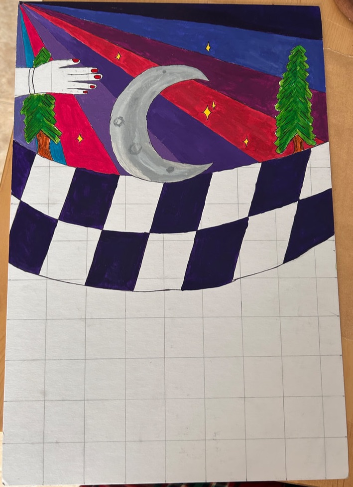
In this stage I started with painting the moon to set a placeholder for the sky then I painted the trees in gouache, and I felt much better about the trees here and I see a clear improvement in skill. Then I painted stars in the sky in yellow, and the sunset colors in the sky. The final sketch was pretty much identical to what was on my board. I feel really good about this top section of the painting
|
Stage four:
|
I painted the hand with a lot of difficulty in creating skin tone so I used a thicker sharpie and really liked the effect. I painted wavy lines in the bottom portion not going with me this time. I do not feel good about how these lines turned out I wish I would have made it the inverse of the first piece instead, but it does match the second photo by Beth Garrabrant in its dullness. Overall I like the colors in the sky more they feel very bright but still represent nighttime. I feel good about the representation of my theme, how things around me can change and uncertainty will present itself but I can still adapt nonetheless.
|

|

|
Experimentation:
|
I experimented with mixing gouache colors, this was for the ground in the first painting, it was green mixed with yellow to make it lighter, and a little white to lighten the tone, it turned out really well and I feel that the tone matched the other shades on the board due to the added yellow. I did another layer of green gouache before I felt done with it. I did a similar process with mixing the shade of blue that goes on the ground in the first painting as well. I mixed a little white to make the blue match better with everything else. I also used this process on the second painting with the trees and it turned out better than the trees on the first photo. For the trees here I used a very similar process, diluted the light green and then added a new practice, layered a darker green overtop of it. I liked this practice much better than using the two colors together and striping them on the board, with made the trees to dark. If I did another project in gouache I would use the practice to create trees I like, it encouraged me to continue on with this piece, I felt confident in what I was able to do with the trees so I felt better about painting the rest.
|


|

|
On this painting I started to outline the different sections in sharpie after I painted them. This was to have more clear distinction between the colors and not have to try and stay in the lines when painting. On this painting I started to use acrylic instead of gouache because I had more acrylic colors that would lend themselves to the sunset. I also started using a different brush that was smaller and pointier, this was a hindrance to my painting because it was harder to control than the small flat brush I used with the gouache. However, using the sharpie after painting was helpful and I did it throughout this painting.
|
|
This is the hand I outlined in the thicker sharpie, it looked more abstract than what I was going for but I ended up really liking the effect, it looked almost animated. I wish that I would have continued to experiment with this look because the effects were quite pleasing. I also knew that the paint on this part of the painting would be too thick for the sharpie I was planning on using. It does not match the arm on the other painting entirely, but that I felt it was good to get some more distinction between the paintings. The thick sharpie went with the aesthetic of this painting whereas the thin sharpie went with the aesthetic of the other.
|

|
Critique:
|
|
|
|
Similarities may include:
Differences may include:
- Both inspirational pieces have two or more components to them. The photos are two different photos that are meant to go together, much like my pieces, they contain differences but are meant to be seen together. America Windows has three separate blocks of glass that are meant to be seen all together, like my pieces.
- The use of line in America Windows is similar to mine, the lines are clear and break up blocks of space, my piece does the same, however, the lines in America Windows only occasionally break up different colors, where mine always break up different colors.
- In the photos, Beth Garrabrant uses trees in both photos, a continuation of the other, my piece is the same, there is an arm going through the two pieces connecting them and being a repeated element.
- In the photos there are lines pointing to the subject through the trees in the background, in my pieces there are lines in the sky pointing to the subject.
- In the photos both have the same subject of Taylor Swift, both my pieces have a subject of myself.
Differences may include:
- Stained glass and photography. Making my piece less detailed than what is able to be captured in a photo.
- The use of color in the photographs are dull and not a central aim of the photo, however, in my piece color is very important and something I really focused on to make the piece more illustrative and match my personality.
- The use of color in America Windows is in one color to create cohesion between the three separate blocks of glass, whereas my piece uses multiple colors to create contrast in the two pieces.
- America Windows has many subjects, throughout the stained glass, my pieces contain only one subject of myself, there is no such equivalent subject in America Windows. The arrangement of details is very different between the pieces.
- In one of the photos the subject is very close to the camera, putting emphasis on that subject, in my piece the subject is further away from the viewer, putting less emphasis on me, and more focus to the background.
Reflection:
I feel that this project helped me to get a lot better at using and blending colored pencils, I had used colored pencils in the past, but not to blend colors together, and so using them in that way was new and proved to be easier that I thought, when I was doing the project I saved that for last because I was scared of messing up with colored pencils, but their use proved to be easier than I thought. Now with that experience I feel more prepared to do a more complex project with colored pencils and other mediums that I'm not confident in. I had two, ambitious inspirations for this piece, one of them was in stained glass, called America Windows, and the other were two photos by Beth Garrabrant. I used America Windows in the background to separate the different colors and create a stylized version of my other inspiration, I was also inspired by the decade it was created in, the 70s, I used a lot of bright colors in the first piece, inspired by that decade. The photos by Beth Garrabrant I used in the subject, to frame myself in different situations to express that no matter the changes around me I will more or less stay the same, sort of an ode to my determination. I used acrylic in this piece a lot, I had used acrylic a lot in the past, so it was easy for me to manipulate and get the colors and opacity I wanted. My favorite part of this piece is the colors I used, mostly in the sky, I used a lot of varied and bright colors, representing sunrise and sunset, I liked using and making these colors. My least favorite part was making the skin tone for the hand, it was hard to match and get right, and when I painted it on it was really thick. I hope that people see this and think of all the time that it took to complete this project and how it is a reflection of my life and how things have changed.
ACT Questions:
Clearly explain how you are able to identify the cause effect relationship between your inspiration and its effect on your artwork?
- Effects on my artwork from the inspiration are identified by the way the background looks and how the subject is portrayed.
What is the overall approach the author has regarding the topic of your inspiration?
- One author has a very careful approach with her photos, and the other has a more grand style with the stained glass.
What kind of generalizations and conclusions have you discovered about people, ideas, culture, etc. while you researched your inspiration?
- Most stained glass pieces are very large and are built for a specific purpose, celebration, religion, etc. Most photos by Beth Garrabrant are delicate and taken with care.
What is the central idea or theme around your inspirational research?.
- Having two things that seem unalike come together and create something new
What kind of inferences did you make while reading your research?
- That the photos by Beth Garrabrant are meant to be seen together, because they contain many similarities, like their subject, and were both taken close together in time.
Bibliography:
“America Windows.” The Art Institute of Chicago, AIC, www.artic.edu/artworks/109439/america-windows. Accessed 28 Nov. 2023.
Garrabrant, Beth. “Overview.” Beth Garrabrant’s Portfolio, 2023, www.bethgarrabrant.com/overview.
Garrabrant, Beth. “Overview.” Beth Garrabrant’s Portfolio, 2023, www.bethgarrabrant.com/overview.
