
|
Overview:Title: Freedom
Size: 50.165 x 71.755 cm Medium: Cardboard Completed: February 2024 |
Exhibition text:
Using inspiration from Claes Oldenburg and Vincent Van Gogh, I wanted to create a cardboard wall hanging that can take the viewer's eyes around the piece seamlessly and calmly. Using cardboard as the medium, only using pieces I have found, I wanted to create my definition of relief, which to me means the feeling of a lack of insecurity and being free from the fear of being perceived, the objects have multiple meanings in the piece, similar to the ambiguity that the tree in Starry Night has.
Inspiration:

|

|
Vincent Van Gogh, Claes Oldenburg: Van Gogh, was a wildly talented impressionist painter who created many paintings in his lifetime. The piece starry night is a night sky view with stars and a moon in the background. I wanted to use this piece because it has a lot of movement and organic shapes in it and I want my piece to end up with a similar feeling of how the eye moves through the piece. The ambiguity that Starry Night has to me is something I want to use, the objects on the cardboard in my piece are not meant to be just one thing, they mean something to me but I want it to be vague enough for someone else to see something different. The pop art sculpture from sculptor Claes Oldenburg is for the dimension, scale and physicality of the project, Claes uses scale in an interesting way, depicting scale so larger than life but in a very clean and polished way. I want the scale of me piece to be pretty large and I want it to look organized and with clean edges, which I imagine should not be difficult because, cardboard gets easier to cut the more big the shapes you require are. Claes Oldenburg's artwork in general is also not specific and could mean so many different things to people, just like mine.
Planning:

|

|

|
The first drawing is my personal interpretation of relief: the feeling of being freed from insecurity and becoming my own person, however fluid that is. I wanted to use some contrasting shapes, the sharp spikes compared to the organic shapes of the bodies and heads in the center creates a nice contrast for the eyes. And possibly discusses the difficulties of achieving my vision of relief. The second drawing is of a common theme in my work, stars and the sky but with a twist of abstraction in the bottom. things start to change at the bottom and become more abstract and different from the sky as it gets closer to the ground. I liked the organic lines in this piece, but it did not have enough personal meaning to me, stars and the sky are something that I love to draw, but in this context does not have a huge meaning to me. The third drawing is of two stark rectangles that represent me and my best friend, against smooth and flowering lines. I thought it represented the beauty of our friendship, however I did not like how I executed the drawing, it was a little messy, I didn't like the square border, and it felt rushed. I would like to visit the theme of friendship in another piece, but not at this time.
|
I drew the final drawing on a large piece of paper so that I could have a larger reference to go off when cutting cardboard. I still am going to make some corrections to the drawing, I am going to make the spikes line up with the rectangle in the middle, and make the M in the corner bolder. I plan to make the final piece identical (almost) to the drawing on the paper. I like some of the elements going off the border, I think it adds a lot of movement. I am using shape, movement, and contrast in the piece. Shape because of the circles and rectangles in the piece. Contrast in the change of texture between the exposed cardboard and the smooth cardboard. And movement because of the lines guiding the eye to other locations on the piece.
|

|
My theme will be evoked in the piece because of the feeling of relief from insecurity, having to do with the person and their identity. Feeling relieved and free from insecurity is something I would love to feel, but can feel trapped and stuck by it, and so this piece is a representation of what relief feels like.
My steps of creation will be: getting cardboard, cutting it to size, and making the shapes, I plan on only using cardboard for this, but maybe experimenting with dying the cardboard. I think that this will involve some trial and error but I have used cardboard before and feel comfortable enough with what I can and cannot do.
Process:

|

|
I started by taking a piece of cardboard and removing the top layer to reveal the layer of perforation. I liked the effect this had on the background, and it added more texture and depth to the piece. It was hard to do this to the whole area of the piece and took the most time out of all the steps I took. The back of this board would be glued to another piece of plain cardboard to ensure stability. I had planned to add another piece on top of this for the base, where all my shapes would be glued to. So far everything was going according to plan. I should have come up with a better plan to remove this top layer, but I didn't, and overall it looks fine, and I was able to tweak it later on to have less of the residual paper underneath and look more like straight stripes.

|

|

|
|
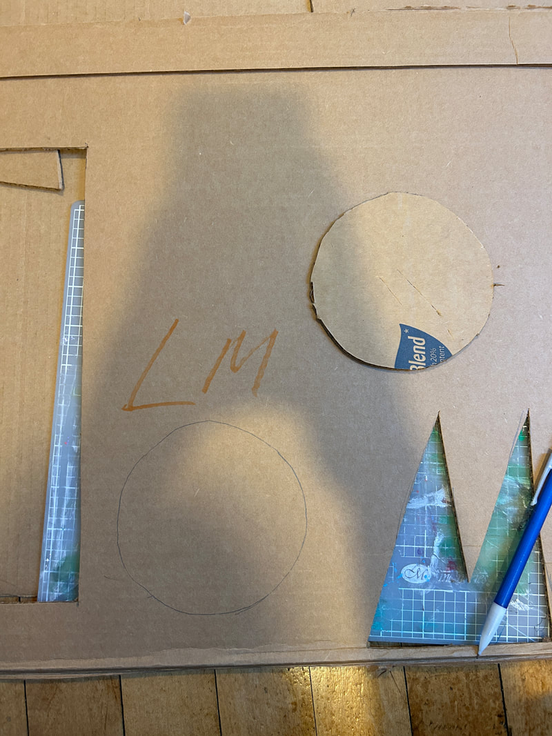
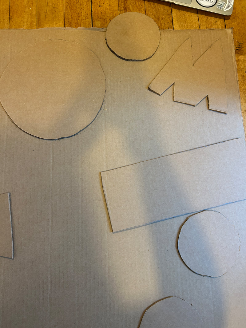
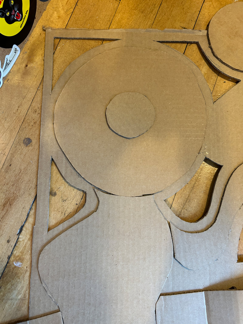
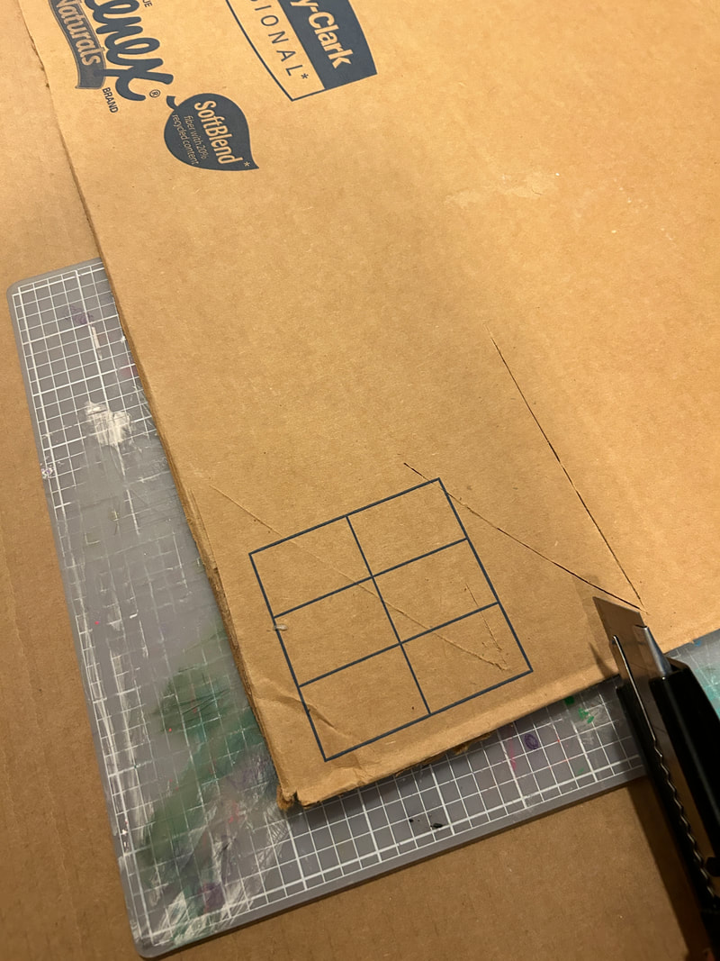
After I had found the base and laid it out, I started cutting out shapes for the bump outs, using the occasional reference, mostly for the circles. I used an incense holder as a general shape outline for the big circle, and as an exact reference for the smaller circles. This was the first step that made my piece look like the reference picture. It allowed me to use my judgement to discern if the shapes felt right in the piece. I also got better at using the box cutter I was cutting shapes with. The skills I got from this made me want to work with cardboard again in a different capacity, maybe with color. I didn't use any colored cardboard in this piece because I didn't think it fit, the texture and the thinness of the colored cardboard wasn't something I was looking for in this piece.
|
|
|
|
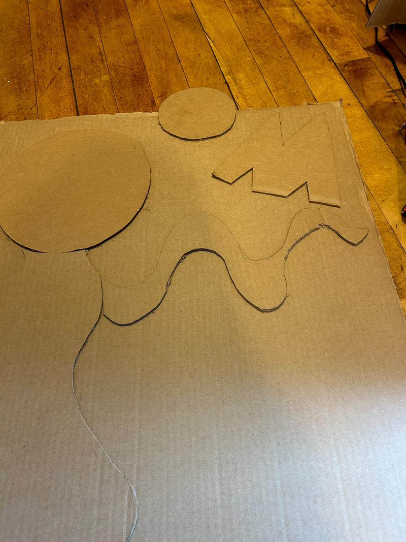
I continued the process of cutting and glueing shapes onto my base. I always first sketch the shape I want to cut then cut it with the box cutter, I had a harder time with the organic lines in the piece, they became harder to cut out and I made some mistakes when cutting them, however, they were minor enough for them to not be noticeable from far away. I was using a hot of hot glue at this time for the glueing of the shapes to the board, and I found it to be very precarious to work with. I would always press down on the shapes I was glueing to ensure that they would stay in place. With the larger shapes, that required more glue, sometime to glue would already be dry in some spots, which was a challenge. Also during this step I added a bump out, it involved some trial and error with getting the height where I wanted. In my sketched I thought it would be lower to the project, but I like where it ended up because it adds some dimension to the piece, as I thought it was feeling a bit flat.
|
|
|
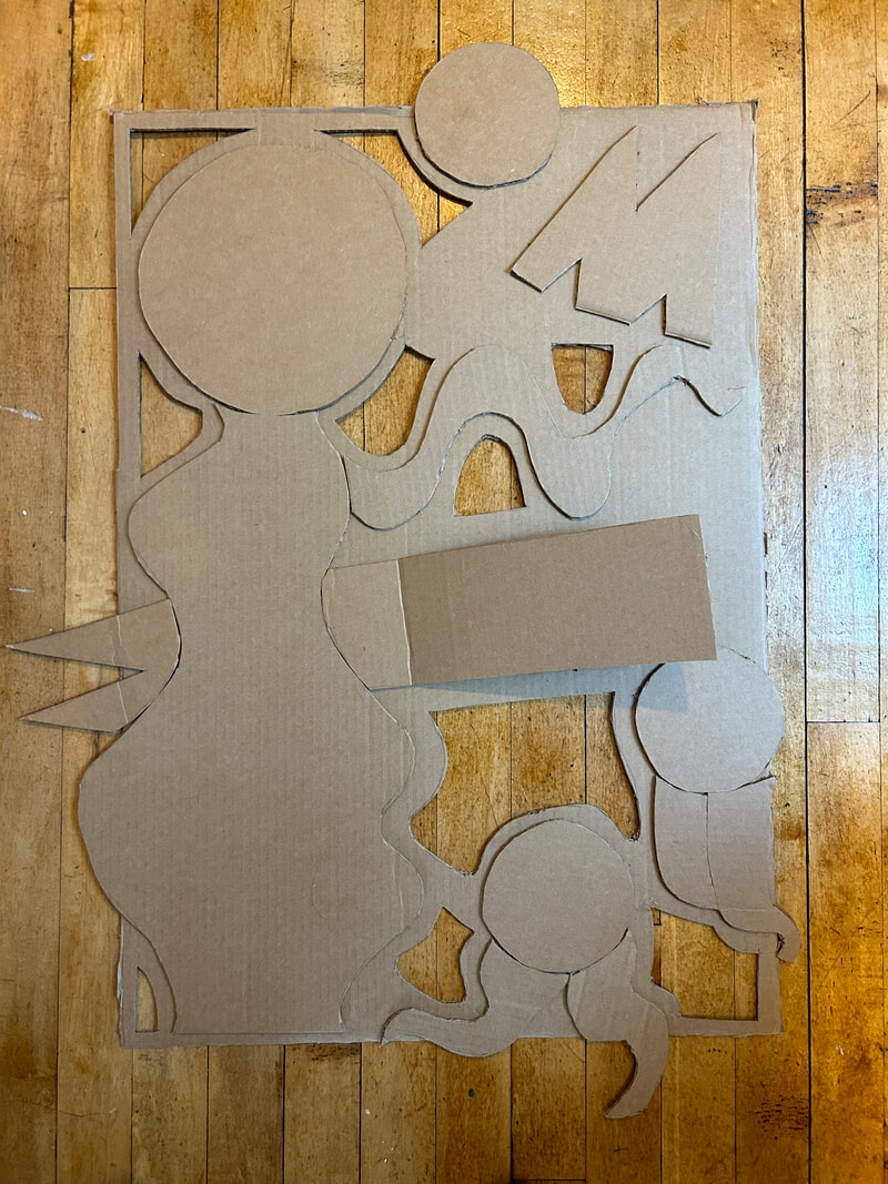
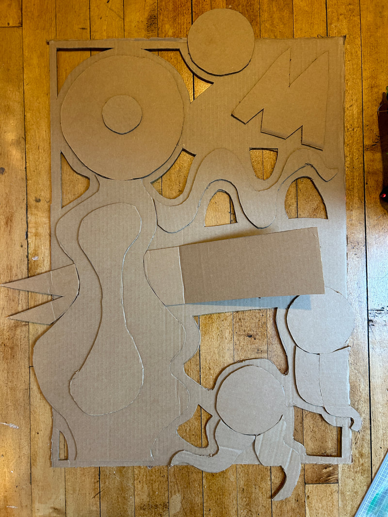
I completed the base, and I started to make cut outs from it where the under-layer would stick out. Making the bump outs was really where the piece started to come together in my mind. it felt very whole and I liked the dimension. I think going back I maybe would've had another layer behind the base layer to add even more dimension, and prevent any flatness. Once I had done some cutting of the base layer I added some more shapes onto the top of the biggest ones. I had not planned on doing this as much but it made the piece feel more dimensional and I liked it.
|
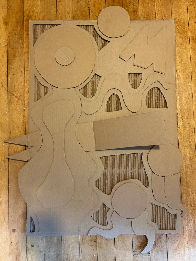
I finished the piece by glueing the base board onto the under layers. I used a lot of hot glue to do this, maybe going through one whole tube of hot glue. The lighting in this photo was a lot better than when I put it on the wall with a nail. Looking at the piece from this angle it feels flatter. Looking at it from other angles makes it feel more dimensional and less flat. I think using colors specifically to highlight some parts would also be helpful at this time.
|
experimentation:
|

|
I found the cardboard staring to warp after I glued one layer to the perforated layer. I found this challenging and frustrating. to handle this situation I tried to bend the cardboard back into shape, just by putting two hands on it. I hope this worked the cardboard back into shape, but I'm not exactly sure, I moved on to working on other aspects of the project, and found that the problem resolved itself once I glued the base layer on top of it.
|
At first I didn't really have anything that I was cutting on except for other cardboard, but this stopped working for me when I cut something I didn't mean to. So after this I made sure to have a surface that I didn't mind cutting into for the rest of the project. The surface I cut into was not that damaged and after the project was done, nothing was harmed and I didn't get that much hot glue on the floor. Using the cutting safe surface was good for the project and I could tell when I had hit that when cutting instead of more cardboard.
|
|
|
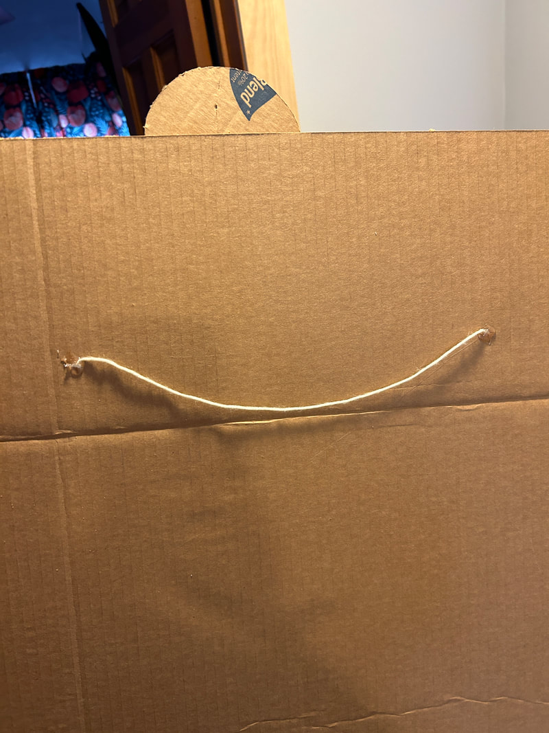
For the final step I needed a way to hang it up and so I thought maybe just using some yarn would work. I made to little holes in the back and filled it with yarn, I then put a lot of hot glue on top of that to hopefully set that into place. This worked pretty well, I tested it both on my own and then by taking down a poster and putting the sculpture there. This worked well for me and I found that the yarn was pretty strong and held up the whole time.
Critique:
Similarities:
- The body-like figure on the left side of my sculptural piece mirrors the tree on the left side of Starry Night. Maybe connecting to the body's connection to the earth and to nature.
- The pop out on the right side of the piece and the spoon handle on Spoonbridge Cherry are similar to each other in shape and the way they pop out of the composition that is flatter or lower to the ground.
- The wavy lines in the back of Starry Night, and the wavy lines of the hair on the right bottom side of my piece are similar in the way that they move and they take up space in the back of the composition.
Differences:
- The colors used in both pieces are vastly different. I have a one toned piece and the inspirational pieces are full of color.
- The inspirational pieces interact with the spaces that they are in so much more than mine does, I think my piece is very independent from wherever it is placed. the two other pieces demand attention.
Reflection:
I feel that my work in cardboard successfully gained my skills in that area and in the precision I have using knives and other things when cutting into hard objects. I feel that if I were to do the project over again I would have done better in terms of precision, as well as in technique and really getting into what I would like the project to look like in the end. I think working with my hands in this way and learning a new medium is rewarding in that I feel good about using it again. I used two inspirations, one was Starry Night, and the other was Spoonbridge Cherry. I think the inspiration connects in small ways, over the whole piece and I can see the ways it connects. The biggest challenge I encountered was using the right amount of hot glue and not having it dry out within the time I was spreading the rest of the glue. I found that the skills required for this piece were a cumulation of what I had been doing all these years cutting boxes. My favorite part was making cut outs in the back layer because I liked the break from the regular flat cardboard. My least favorite part was picking the top layer of the cardboard off for the under-layer, and I think finding a new way to do that would be best, this process was very time consuming. I hope others view my work with the knowledge that it is about the relief from insecurity and a feeling of freedom from traditional views of the body.
ACT questions:
Clearly explain how you are able to identify the cause effect relationship between your inspiration and its effect on your artwork?
- the movement and the lines felt in both inspirations can be felt in my pieces. the tree in Starry Night and the body on the left side of the piece are similar. the pop art elements of the bump outs are similar to the physicality of Spoonbridge and Cherry.
What is the overall approach the author has regarding the topic of your inspiration?
- I think both artists take a slow and methodical approach, one with care and attention to their subject matter.
What kind of generalizations and conclusions have you discovered about people, ideas, culture, etc. while you researched your inspiration?
- I think generalizations are made about the environment surrounding the piece, this is seen exactly in Starry Night, and in whatever environment Spoonbridge and Cherry is placed in.
What is the central idea or theme around your inspirational research?.
- I wanted something free-flowing and expressive to base my project around and guide it.
What kind of inferences did you make while reading your research?
- I found that the artists have a large body of work that is similar and dissimilar to the pieces I chose.
Bibliography:
Vincent Van-Gogh / "Starry Night" / 1889 / Oil on canvas / 2' 5" x 3' 0" / MoMA
Claes Oldenburg / Spoonbridge Cherry / 1988 / Stainless steel and aluminum / 1,199 lbs / Minneapolis, Minnesota.
Claes Oldenburg / Spoonbridge Cherry / 1988 / Stainless steel and aluminum / 1,199 lbs / Minneapolis, Minnesota.
