|
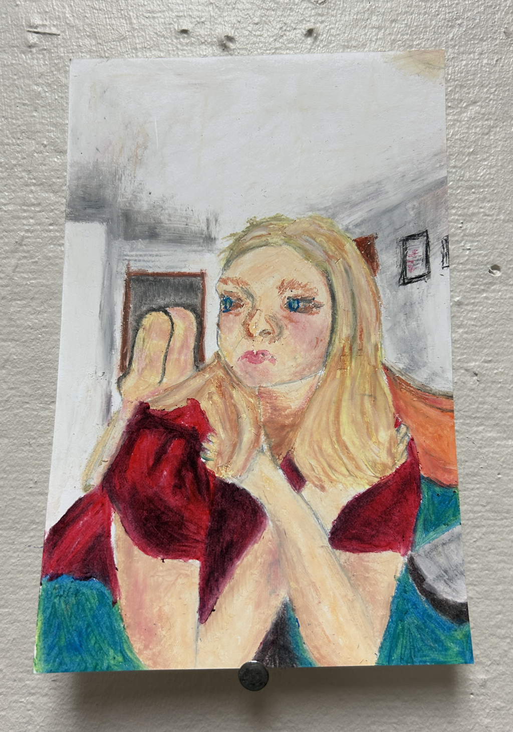
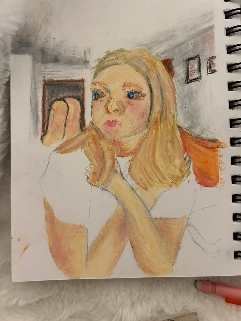
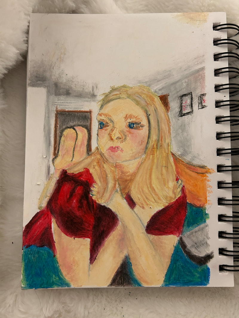
Overview:Title: Shiny Rockstar Girl
Size: Medium: oil pastel Completed: March, 2024 |
Exhibition Text:
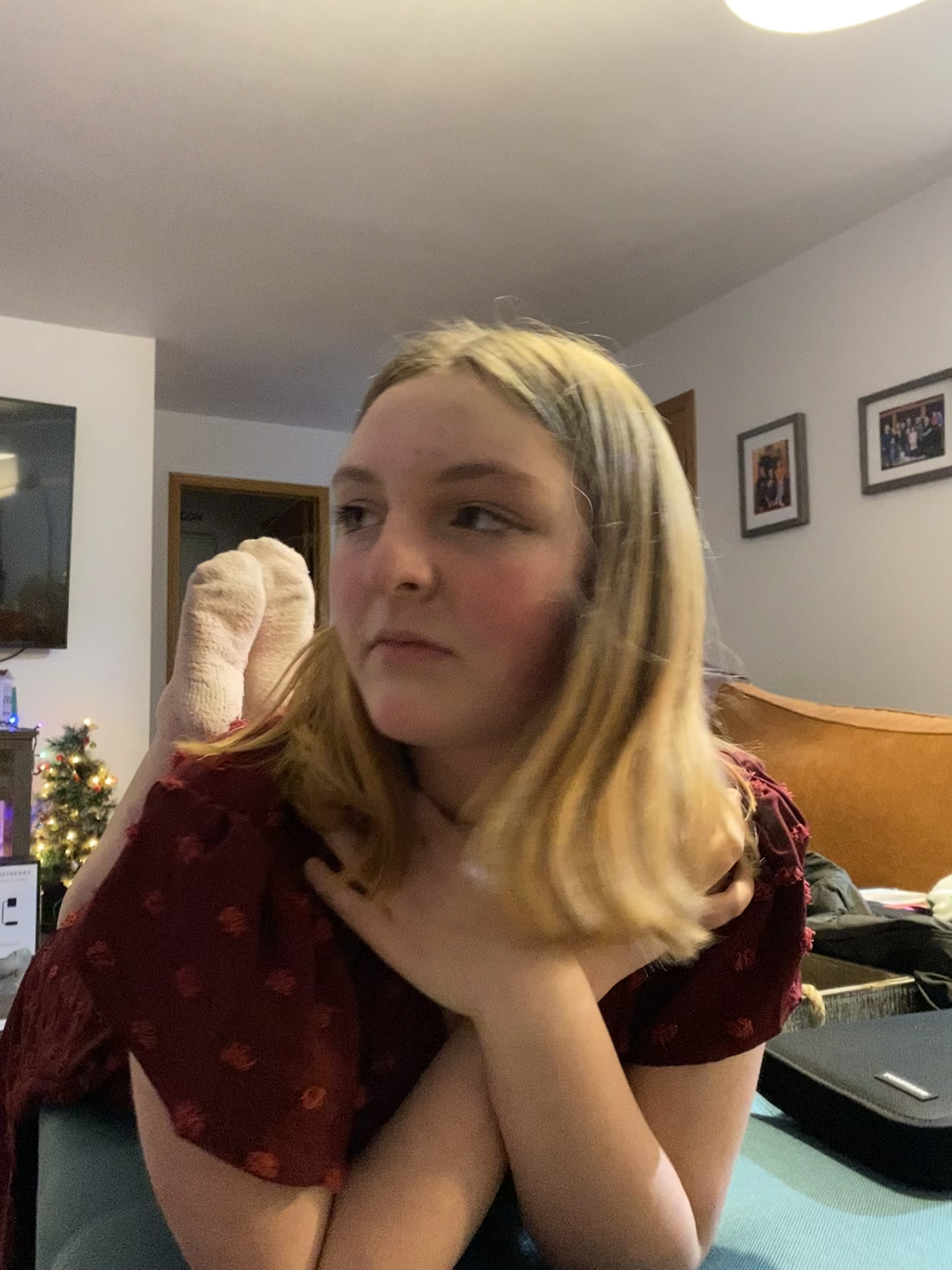
Using a photo I took of my best friend on New Years of 2022, I wanted to capture the spirit and personhood of my best friend. I found a nice medium of oil pastel with inspiration from Edgar Degas. I wanted to do a simple portrait of her to capture what I see in her, and how much she means to me. The technique I used is slightly different from Degas’s style, I wanted to experiment more with my own style, using color and shape inspiration from him.
Inspiration:

|
|
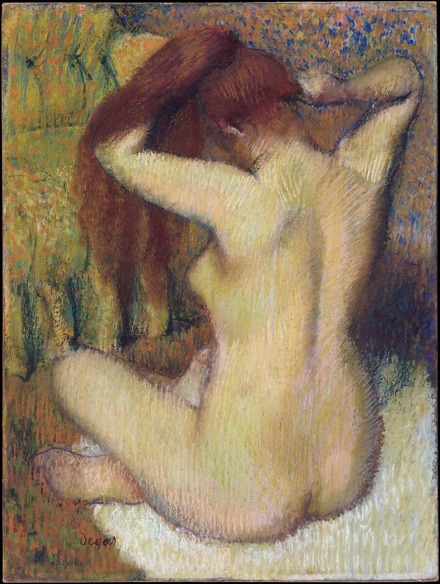
Woman Combing Her Hair - Edgar Degas.
I plan on using this inspiration in the subject matter not in the technique. the technique in this is very similar to impressionism as opposed to the more fluid style I wanted. The portrait is very stylized and I want my composition to come more naturally. The painter clearly has care for the subject, and I want that to come across in my portrait as well. The smooth lines and bright colors I hope will show this.
I plan on using this inspiration in the subject matter not in the technique. the technique in this is very similar to impressionism as opposed to the more fluid style I wanted. The portrait is very stylized and I want my composition to come more naturally. The painter clearly has care for the subject, and I want that to come across in my portrait as well. The smooth lines and bright colors I hope will show this.
In this artwork there is a naked woman sitting on the floor combing her hair, other than that, little is known. My first reaction was that this is pretty scandalous, it's walking the line of being a nude, and I think painting someone in that position is intimate. The hair is emphasized through color, so is the chair, by color as well. Also the model is emphasized through her pale skin standing out against everything else. the eye moves through the composition top to bottom, starting with the head and moving to the body. Like how someone would check someone else out, mirroring reality. The artist used an impressionist technique, as he was an impressionist, it fits with his choices otherwise, even if the medium doesn't.
Planning:
|
|
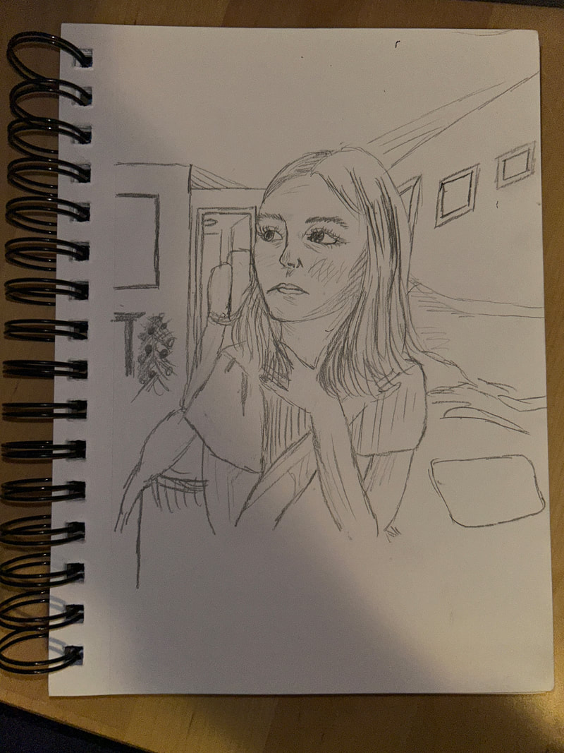
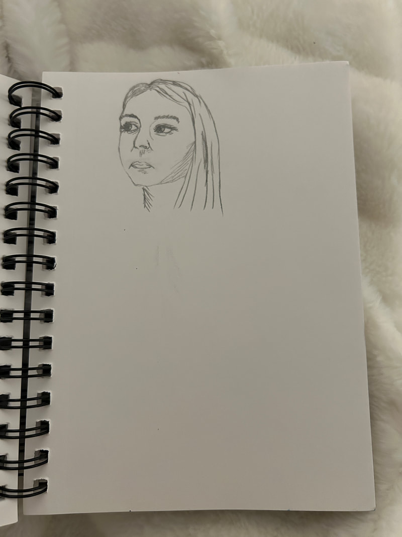
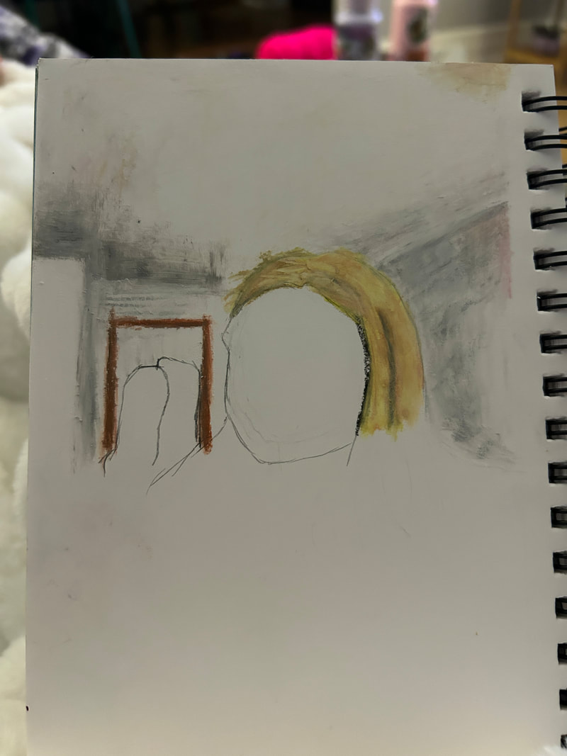
I started in a sketchbook that I had laying around, it has nice quality paper and I'm familiar with how much I can fit in it. Then I began on a sketch of my reference photo, I sketched everything I saw, trying to focus on the proportions. I don't think this first attempt was too bad and I feel like it could have been something I worked off of if not for the harsh pencil lines that I knew would show up from under the pastel from my experimentation with the medium. I used this initial sketch to familiarize myself with the proportions and where everything should lay in the composition. I also found that this paper was a little too big for the photo I was using and I needed to crop the photo a little bit to have it all fit. I did that and I felt confident in where I was going from there.
|
|
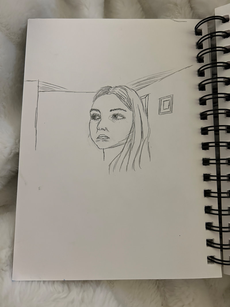
I then did two more sketches in this sketchbook, I felt like these were notably less successful, so I didn't work off of any of these and instead switched course and decided to not do a sketch underneath because of the pencil lines and sort of plan it out as I go. I think I could have made a better plan to move forward with more skills to plan these things out. But the way I ended up doing things I think turned out alright. These sketches gave me preparation for how difficult the project would be when working with this medium, because it was not able to cover pencil lines. I think switching course was the right idea for me to get the oil pastel on paper, instead of getting caught up in the small details. My theme plays into this project because I feel that identity is closely tied to those I love. Rose is a big person in my life and my identity cannot fully be explained without the care I have for her.
Process:
|
|
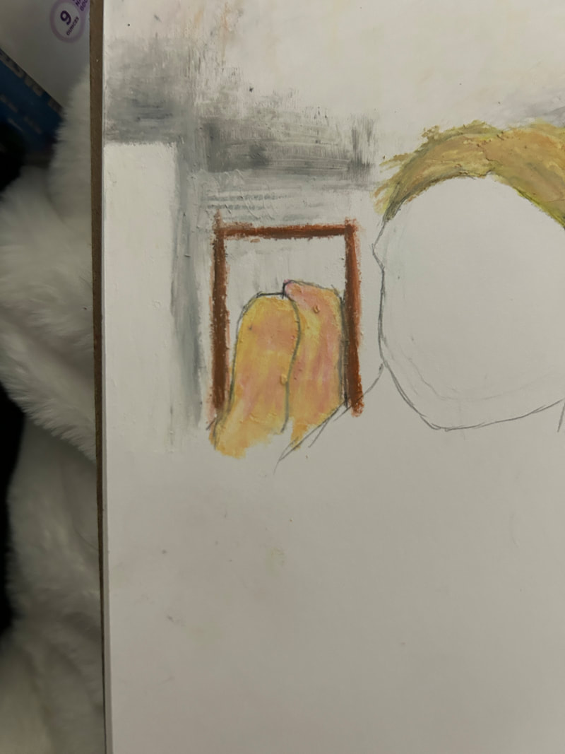
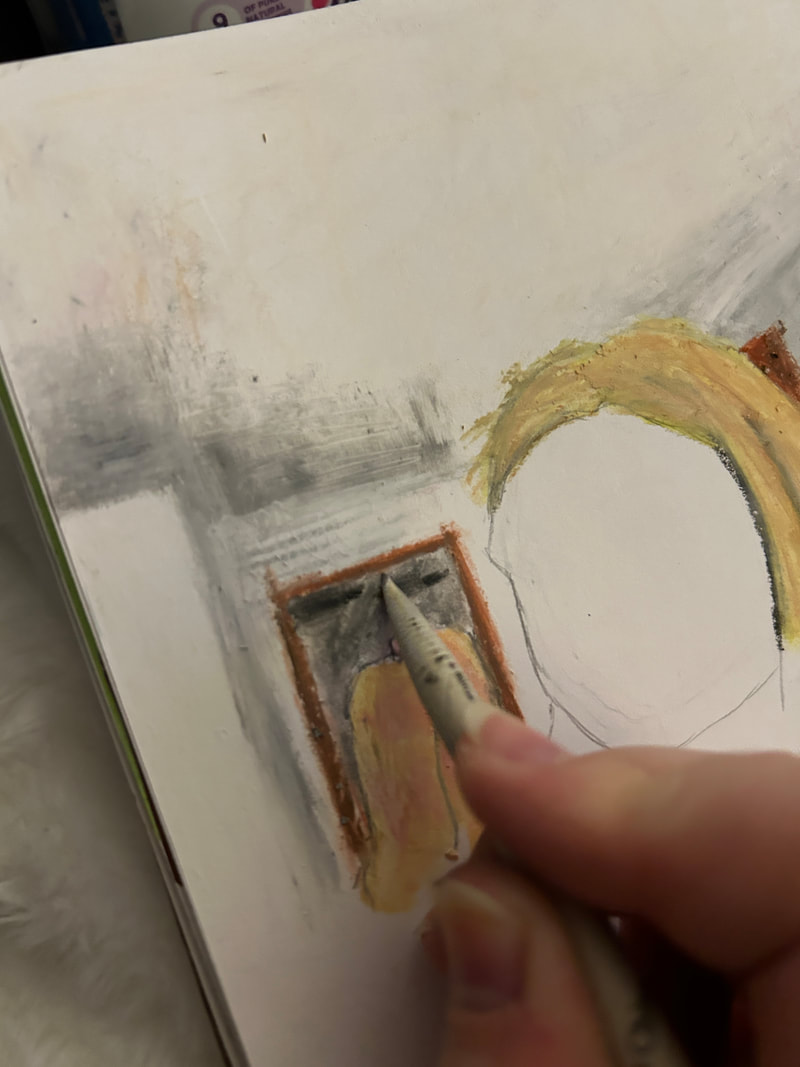
I started, while looking at the reference, that the ceiling was almost totally white, and without looking too deeply at the nuances of the colors in the photo, I used a white pastel to color the ceiling. This was just a base layer, and I feel that it was a good starting off point, it gave a lot of reference for the rest of the portrait, and I was able to layer colors on top of it. I did do a little bit of sketching first just to have something to go off of, but I erased a lot of it and tried to cover the rest. I found that having a thicker layer of pigment took a lot of pastel, and I tried to be mindful of how much of the pastel I was using for the rest of the project.
|
|
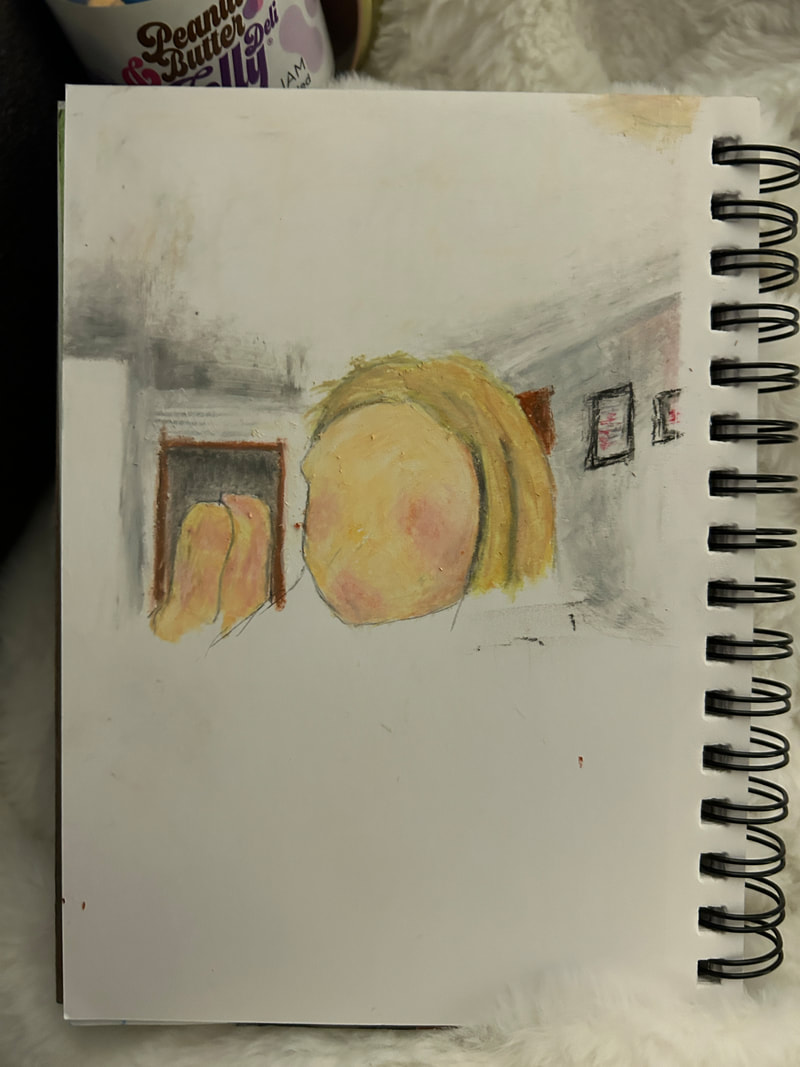
The next step after the ceiling was adding shadows, the end effect was really dirty looking, but I didn't mind it too much, it felt more dramatic and I was alright with it. I also added door frames and pictures on the wall. I started working on the first half of the hair, which I added too much black to and had to go back and correct that later. I started on the face too and added a skin tone with pink and red for the rosey cheeks. I felt confident about the face and the cheeks at this point. I was going top down at this point, which was not intentional but just how it worked out. I felt especially good about the socks, the colors were really easy to work with and the colors I felt were accurate to the reference.
|
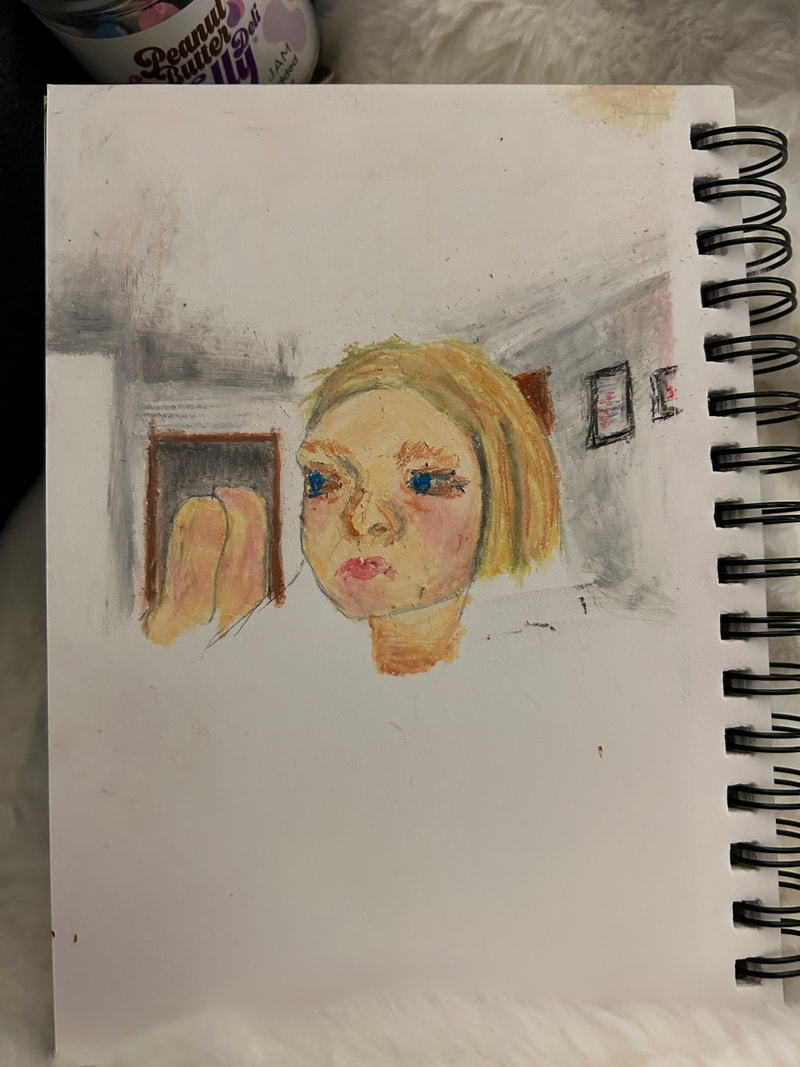
|
After the last steps, I added a face and the hair to the portrait, and I didn't think it looked too much like her, but I thought the resemblance was close enough. I now know that the face was too little and I should have made it longer. I felt good about the second half of the hair, it was the kind of blond I had known her to have. and the face, while a little small still felt like her. Having such a small area to work with was difficult with the large pastels, so I had to adjust to use the surface area. That could have been a part of the reason I don't think the face was successful. Maybe using a sketch first would have had a smoother time, although I like how little the pencil pops through. I do like using oil pastels and I want to try again at using them.
|
|
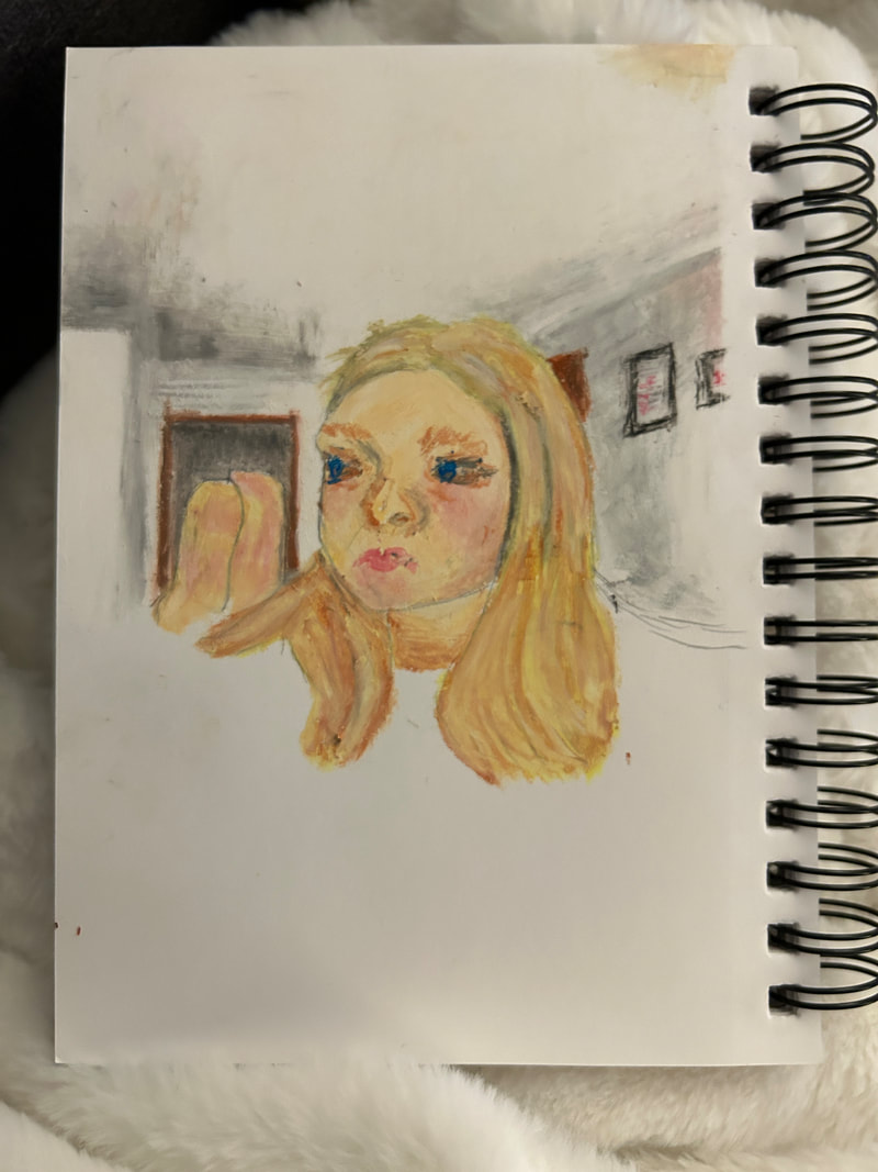
I started on the arms after the hair (although they look similar) and I like how they look, the shading could have been darker, but the overall look is good enough for me. The arm on the right is too small, but I realized too late to fix it. In fact I did fix it once already and made it bigger. I don't think I did enough shading on the right arm either. The dress was my favorite part to draw. I used the red shading and the black shading together and I think the effect is successful. The dress is something so intrinsic to Rose and I like how much it resembles the real one, but I wasn't sure how to do the lighter pom-poms on the dress. I stopped putting a lot of effort into the shading at the end so the patterns on some of the things were cut off or not completely represented.
Experimentation:
|
The socks were one of the things I put off doing because I did not have an exact color match. I decided to mix pink and yellow to get the orangey color I did. I think just putting color on the page was one of the things I did well with. I did not plan my steps too much, and perhaps that would have saved me from a few mistakes it also gave me some success. I left the success with the socks to move on to the door and it provided me with some confidence. There were still some pencil lines on the page that I was not happy with but I moved on, and I fixed it later with some shadows near the socks, it's not perfect but I'm okay with it.
|
|
The door was a challenge for me because it had to be the darkest value on the page, according to the photo, but the values of the walls and ceiling were already really dark, so I was worried with how dark I really had to make it. It also brought in some feelings with if the black would suck all the color into it. Or if it would be distracting. It ended up fine, as usual I put too much thought into how colors would look on the page, without thought of proportion. I used this instance to move forward and keep pushing with the thoughts of how I could accurately represent this. I think I did my best to represent this, without putting a lot of planning behind this.
|

|

|
When beginning to work on the dress, I layered black on top of red and used a blending tool to smooth out and make the shading look complete. The blending was one of the easiest parts of this because it was so intuitive. The better I got at it the faster it took me and the more I felt it was accurate to the picture. In the end accuracy is not what I got, but it's what I will keep working torwards.
|
Critique:
|
|
|
Differences may include:
- the technique of oil pastels used. I used a smooth and blended technique, while my inspiration uses an impressionist approach, with the lines being clear.
- The features shown, my piece included the rosiness of my friends cheeks, and some other areas like her arms, where my inspiration has a very perfectionist approach to the subjects body.
- The detail on the inspirations background is very clear, it puts the viewer into the scene through the use of details and technique. Where my piece because of the smoothness has a more detached closeness to reality.
- The inspiration probably has a sketch that it is working off of, where I only have some light sketching to go off on and my photo reference.
- The places that are emphasized. The hair is emphasized in my inspiration through color, but the dress is emphasized in my piece through color and value.
Similarities may include:
- Both pieces have a clear subject framed in the piece, mine is my friend Rose, and the inspiration's is a naked woman combing her hair.
- Color is a point commonly emphasized in both pieces, there is a lot of color in my photo reference and so I included a lot of those vibrant colors. The other piece, although having darker values, has greens and reds that stand out in the composition.
- Light seems to be coming at both pieces straight on, hitting them in a way that shows their features.
- In both pieces, all elements and parts of the scene come together to form something whole and complete-looking. Nothing seems to be left out of the composition.
reflection:
Working with a new medium and a new style of art making is always constructive for me and I appreciate the new things I learned. working with something new is also challenging and finding the right proportions is hard, but I didn't give up and get frustrated, instead I kept going. My inspiration for the project is a portrait by Edgar Degas, I think it connects in the colors used and the flowing smooth lines of both pieces. The biggest challenge I faced during the project was near the end when I found that the proportions of the face were off and I needed to make the face longer to have it be accurate to the model. But I did not want to go back and it was not an option considering the time I put in already and the oil pastel being immovable on the page. I am fairly unhappy with the portrait in this respect, but I think the work in the background is something to be proud of. I think although I see two issues of proportion I still like the piece for the most part. The things I used in this project are similar to the skills I used to paint with acrylics, although with a more crayon-like form. I think continuing my work with this medium will be beneficial to continuing my skills. My favorite part was matching the colors in the photo to colors in I had in oil pastels, I liked being able to half mix the colors on the page. I find that it was similar to mixing paints, but not quite the same. My least favorite part was how dark the black made everything, it was hard to get light greys with the black being so dark, even mixing with the white. I hope others view my work with the knowledge that this was my first time working with this medium.
ACT Questions:
Clearly explain how you are able to identify the cause effect relationship between your inspiration and its effect on your artwork?
- The smooth lines of the Degas portrait on the body resemble the smooth lines of the couch or the dress. To name one example, there are others in color and form.
What is the overall approach the author has regarding the topic of your inspiration?
- The author uses a calm and methodical approach to his work, it seems that he has care for the person in the portrait because of the smooth lines and the bright colors.
What kind of generalizations and conclusions have you discovered about people, ideas, culture, etc. while you researched your inspiration?
- My inspiration does not express all the little nuances of the body and the hair, it is pretty even and straight throughout. No dark spots or stretch marks.
What is the central idea or theme around your inspirational research?.
- I wanted to find a soft and caring inspiration to base off the portrait, because most of the oil pastel portraits I was finding were dark and far away from the person.
What kind of inferences did you make while reading your research?
- I found that most oil pastel works are landscapes, not as many are portraits.
Bibliography:
https://www.metmuseum.org/art/collection/search/436170
