
|
Overview:Title: Public Spaces
Size: 16.51 cm Medium: Cardboard, paper, clear plastic, balsa wood, wood glue Completed: April 2024 |
Exhibition text:
When doing this project I was thinking about when I was younger and being outside all the time. This time in my life was obviously formative and I wanted to make a space that would become a symbol of childhood to people in the future. I was inspired by Reisinger Studio’s ideas of an interior space and how they make things feel, not so much the way they present these ideas. I gathered the materials needed for this project, all things found in a classroom.
Inspiration:
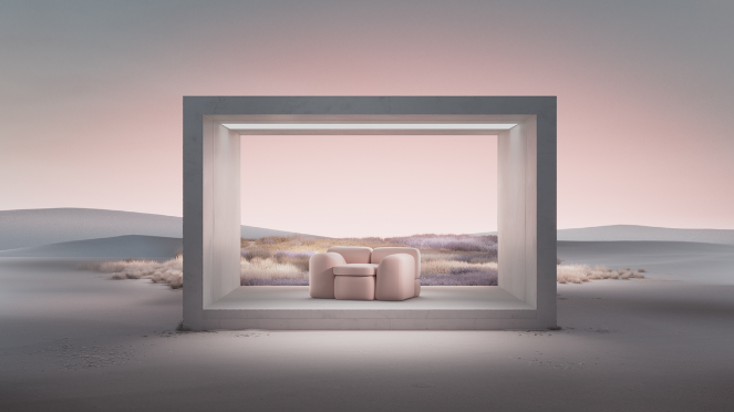
Inspiration: Reisinger Studio - "The Wither"
I plan to use this inspiration in my work, more so as a feeling than a geometric object. I certainly see elements of my work in this, the sharp corners of the top of my model are reminiscent of the sharpness of the whole structure. The cement that the entire thing is made out of really reminds me of what the columns would be made out of if it was in real life. Another thing that stands out as similar is the way that a lot of light comes from the sides, as if this was an actual standing structure there would be light from the sides. Style wise, this inspiration is very stark, and I wanted my structure to be more blended into the landscape. With the way that my structure does look, I don't think that it is completely organic, but it is a lot less in your face that it sticks out. I think in terms of the way that both of the structures would be used is similar, I can imagine a person going in the inspiration's space, and looking out at the grand expanse of nature, same as I can imagine a person going into my structure and looking at the stars or the sky from a protected lookout.
The intent for making this artwork is to provide a pondering space. There is a couch in the middle, to provide comfort, and protection from the bottom, top, and two sides. My first reaction to this piece is that although it is quite stark and sharp, I would like to occupy it. The area most emphasized is definitely the couch in the middle, I say this because it is lit from the front, back, and top. Making it the place where the eye is drawn to, along with the "frame" around it. I think the work was created to make the viewer want to sit and exist in that space, it feels welcoming, it feels like one should be sitting there because it is so emphasized by everything in the world around it. I notice a feeling of desire to be in that space, it feels like somewhere that would be easy to be in, a space to relax and take a pause. The artist used incredible restraint and simplicity to make the work feel like somewhere comfortable.
Planning:

|

|

|
These three models were a part of the first round of ideas for the model. The first one was me wanting to play with light, light comes from the spout of the carton, and the space inside would be whimsical, filled with pillows and comfort. The space would be outdoors, but it would be comfortable enough to relax and still feel comfortable. The second model was me trying to create a very tall space. One would be outside but be sitting under the roof filled with spikes coming down from the ceiling. I liked this model the least out of the three, it did not feel enough like the space on the inside was important to the overall feel of the building, I asked myself how I would feel when inside, and I thought I wouldn't really like the way it would feel. The third model is by far my favorite out of all the models. The one I was going for a gallery interior experience. I really liked the use of the triangle shape created by the slant of the cardboard. Additionally the stripes on the ceiling made for a cool shadow, although I would not continue with the stripe idea. I thought about the way I would feel inside this space and I felt that it would be quite a cool experience, however, when meeting with the teachers of this project, they asked me about the sides of the triangle, and I realized that utilizing this empty space would be beneficial and would lead to more light from the sides, and overall.
For this project, I did not sketch out my ideas, because I feel that when working with 3D mediums, it is best to simply create the things I am thinking about. I would have sketched more towards the end, but I did this once and I took my ideas too far, and my ideas were something not feasible to the materials available.

|

|

|
The phase of the process was still to get an idea for the more professional end product. At the time I felt that this example was some of the best work I had done. The red came from the paper I had available, but it turned out to be something I felt was very strong. I made the legs out of paperboard and covered them with red paper to make it cohesive. The paper was the the only thing on the top of the model, which made things unbalanced, I did not like how much this wobbled, but once I talked to the teachers I learned that I could glue it to cardboard on the bottom for stability, something that had not occurred to me before. Moving forward I realized I needed more of a break in the big windows, and I knew that I wanted clear plastic on the final, but did not want to use it for these draft models. I learned after this model that I should take a monotone approach to the color and switched the red to white. I took these images in my bedroom because I love my bedroom and it is so personal to me, and while I was making these it was cold and I couldn't get to any site I was looking at, I was thinking about a couple different sites at the time.
Process:

|

|

|
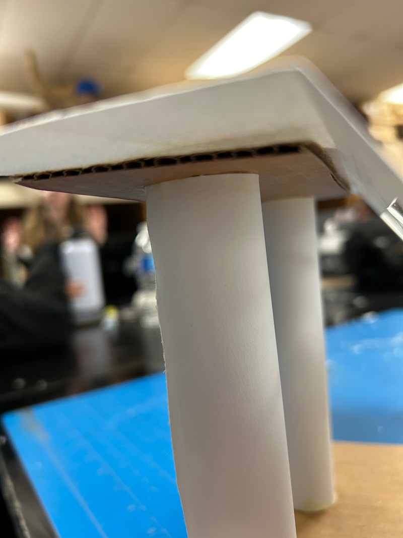
I started the third round of models by adding more frames to the windows, I also added cardboard to the bottoms of the ledges to make things more sturdy, but this still left the paper windows to be the weakest point, and after falling so often it became difficult for it to stand up on its own. This time around I experimented with adding balsa wood to the tops of the ledges, for no specific reason other than I thought it would provide a resting point if one was to climb on top and sit on it, which would be hard to do but not impossible. I was using hot glue with these models, and gaining proficiency with it, from the images one viewing it cannot see any glue sticking out obviously. But after some more meetings about materials I found that using hot glue was not an option and I should use wood glue, something I was not proficient in, and had not used in such a long time. But this was the material I was required to use, so I tried to make the best of it going forward, and in the last round aka my final draft there is wood glue to be seen, but it is only obvious at some points. I also used hot glue still, only in the windows, because wood glue does not dry clear. Using wood glue was difficult, but I realized it was very sturdy and would likely not fall apart. This round looks very similar to the last, and the two gave me a strong jumping off point for the final.

|

|
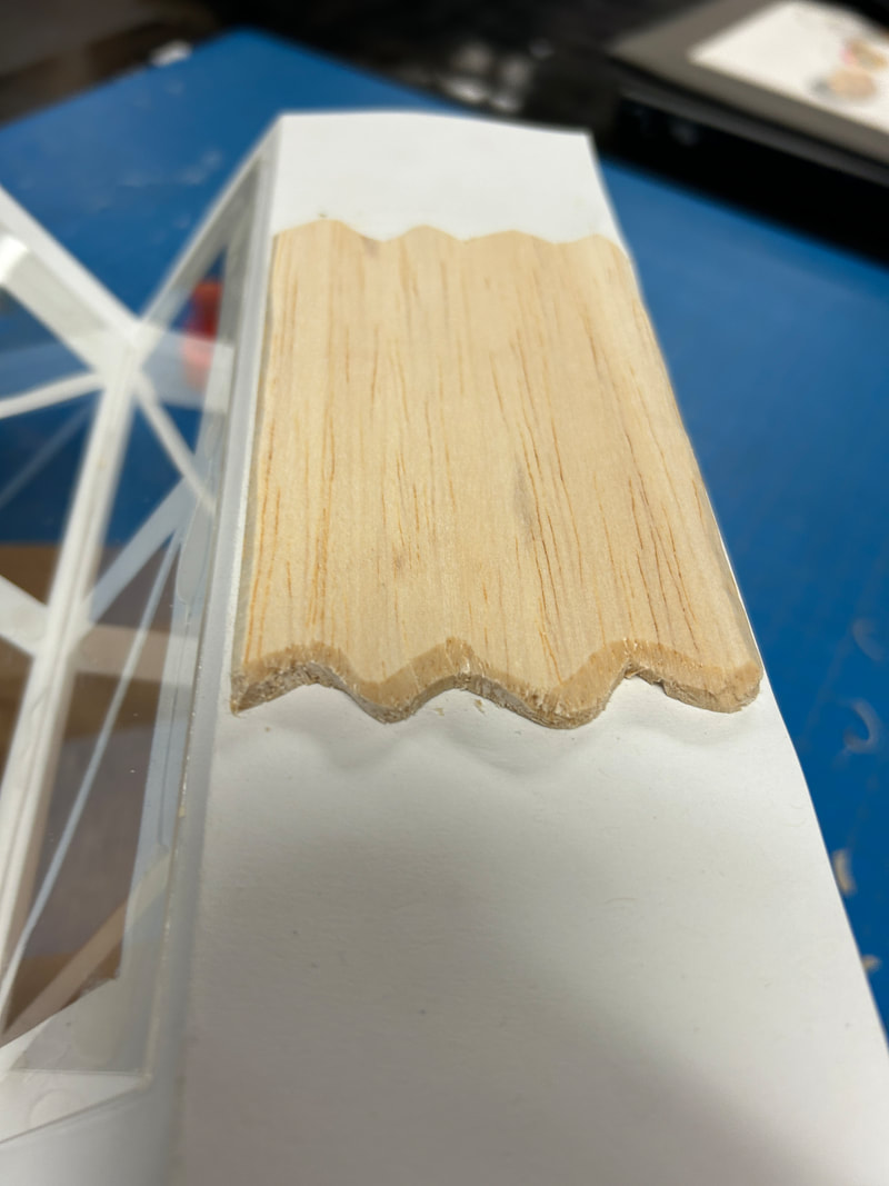
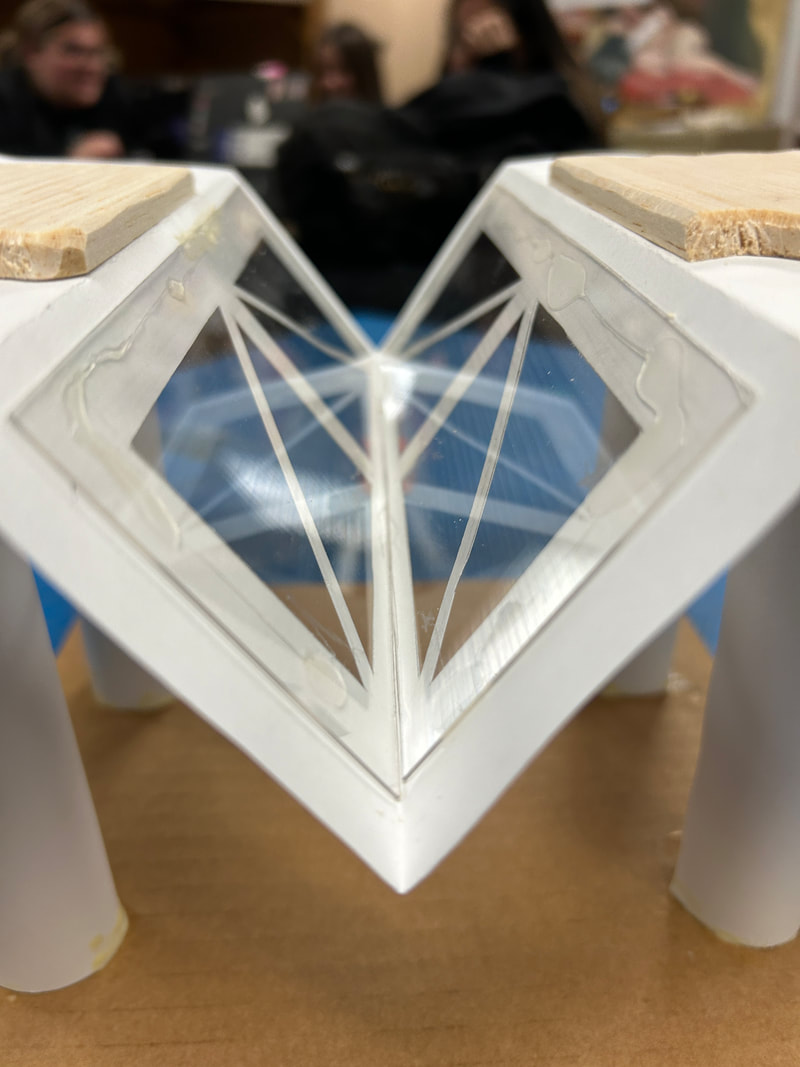
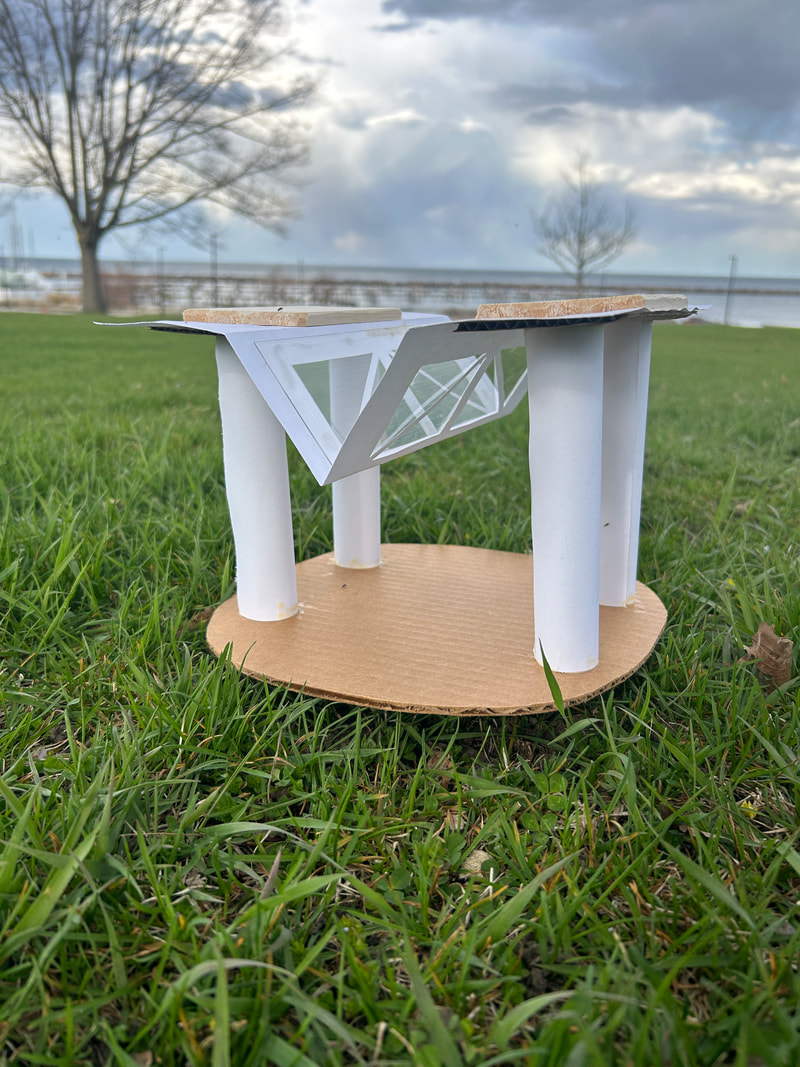
The final stage, was getting creative. I brought back some of my ideas from the first round with the stripes, but I did not go that way with the color, as I could not be that creative with color from the restrictions of the project. The windows are my favorite part of this one, party because they have a reflection that makes the light even greater, which works with the white of the whole thing. The legs are pretty tall for a half inch to a foot scale, but I think making the space as tall as possible adds to the expanse of it, and adds to the idea that this is something you could sit or lay under while looking up at the sky or having a picnic. The sculpture is really an escape from the elements while still being as outside as possible. I added a pattern onto the balsa wood not for a specific reason other than it was not just rectangular. I thought the round edges contrasted nicely with the sharp lines of the windows and complimented the round columns. I glued the bottom to a piece of cardboard and thought it was too sharp, so I made the bottom round. I think in reality I would like the floor to be white, but how was I to make it white in the model. I think this definitely looks like a "grown up" version of the previous models, and if nothing else, it looks like a part of a series.
Experimentation:
|
|
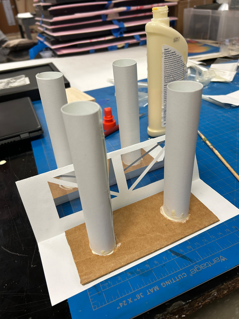
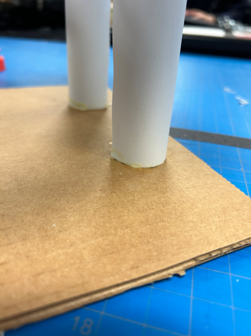
Using cardboard to reinforce the structure with the columns was super helpful in maintaining stability. Doing this did open up for less stability of over parts, but I hoped that using the plastic would give more structure, and it did but because of the top being made of paper it still had its structural issues. This move was a very good one for me to make because although I still needed a bottom to support it felt sturdier. Glueing the piece of cardboard to the bottom was not something I had ever planned for but proved necessary as I went on. I kind of hated the sharp edges that were left once I glued it so I cut off the sharp edges and sanded it down to a more circular shape. The shape I ended up with is uneven but did not impact the overall thing, and nobody noticed it was uneven. Making spur of the moment decisions like that are always hit or miss for me, and with this was sort of a miss for me cause I would much prefer a different ground.
|
|
|
Firstly I chose to use balsa wood on the top of the ledges to hide the wood glue that I was experimenting with, I was not initially planning to use balsa wood in this spot, but it had to be that way because of the warping that came from the wood glue, which would have not happened if I used hot glue. Using wood glue had its downsides, but overall it holds up strong, and when walking in the rain to photograph it in my site, it held strong with the water, and still looks pristine. Using wood glue also on the bottom was challenging, I used a paint brush to get a cleaner effect, but it still looks a little messy in areas. I was not fully concerned with the effect because it was my first time working with it, and I feel for it being my first time that it was successful enough. I feel like working with new things is beneficial, but should have been shown to me. The slight mess created does not bother me. The windows were another new aspect to work with, I used clear drypoint plastic and working with it was sort of fun once I got over some challenges with cutting it. I really like the effect it gives and out of all the new things I did I want to continue working with this medium in the future.
Critique:
|
|
Similarities may include:
- Where the light comes from: most of the light in my model comes from the side, with some of it coming from the top. The inspiration has light coming from the same directions.
- Purpose: both spaces are meant for relaxation and contemplation. The spaces are dissimilar in many ways, but their purposes are similar.
- The environment: the environments are in very large outside spaces, they fill in environments that are otherwise full of nothing.
- Shape: the shapes in the composition of the spaces are very different. The inspiration is stark, and while mine does not blend into its environment, it does look more organic from some of the rounded edges. The inspiration has all geometric edges minus the couch in the middle, which is not an integral part of the composition, in my opinion.
- Space: My model's space is large and full of grass, but is still in a neighborhood. The inspiration is in the middle of nothing, with nothing surrounding it because it is in a fictional space.
- The areas that are available to occupy by people in my model are over and under, but in my inspiration it is just under.
- Contrast: there is a lot of contrast between my shapes and colors used. There is almost no contrast in the stark inspiration. Which has a continuous shape, and is all geometric.
Reflection:
I think using 3D materials in this way was beneficial to me, learning a new material opened up new doors for things to do in the future. I think the way that my skills presented themselves in this project was admirable, it looks like I spent care and time on this, and I can clearly see that this is the culmination of many different rounds of creation. I think learning new things was fun, making things with my hands is always fun, and it's unlike painting because I don't need a steady hand, which I don't have. The project overall felt confused to me, I was unsure of a lot of deadlines, and I didn't know where I was going from the beginning, this challenge was hard to overcome, and I don't think my idea is fully complete but it feels professional from what I started out with. My inspiration was Reisinger studio, and I do not think it connects to a high degree, in an emotional sense it connects, but in a physical sense I just was not going for a similar vibe that they are, their work is very calming to me, and I don't feel calm or stressed when looking at my piece more so it is an absence of those two emotions in place of something like wanting or nostalgia, because I wanted a place like that and because it does feel like something I would have used often, and still would use. The biggest challenge I faced overall was not having direction from the beginning, the way that I organize myself is by knowing what I need to have in the end, and I was not sure what I would have by the end of this project. Materials wise, my biggest challenge was working with the crumbling balsa wood. I had previously learned about architecture although I had never experimented with it like this, I am reminded of when I was a child and I played with blocks, that was a lot like this for me. My favorite part was discovering the clear plastic material, my least favorite part was having to work with a material that I felt tired of. I hope others view my work with the idea that I made this space as a place to observe under, and that I think it would be wonderful to grow up with a space like this.
Act Questions:
Clearly explain how you are able to identify the cause effect relationship between your inspiration and its effect on your artwork?
- I see that feeling of nostalgia in my inspiration and I wanted my piece to have the same feeling for people.
What is the overall approach the author has regarding the topic of your inspiration?
- a very calming and methodical approach, there is a very clear emotion of relaxation and comfort when looking at the inspiration's entire body of work, this somewhat connects to how I wanted my space to feel, although I focused on how it looked, not how it felt.
What kind of generalizations and conclusions have you discovered about people, ideas, culture, etc. while you researched your inspiration?
- I discovered that generally people do not gravitate towards pink as a color to base architecture off of, this does not match with my inspiration but not many architects gravitate towards this color.
What is the central idea or theme around your inspirational research?.
- something that evoked a sense of nostalgia out of me, Reisinger studios did exactly that.
What kind of inferences did you make while reading your research?
- that my inspiration feels a connection to the color pink.
Bibliography:
Andres Reisinger / The Wither / 2021 / unknown medium.
